直到 2020 年,混合模式一直是我很少使用的功能,因为我很少知道它们在不尝试的情况下可以产生什么结果。而采用“尝试一下看看会发生什么”的方法似乎总是让我对我在屏幕上创建的视觉呕吐物感到恐惧。
问题源于对它们在后台如何工作的不了解。我见过的关于这个主题的几乎每一篇文章都是基于示例、与 Photoshop 的比较或冗长的艺术描述。我发现示例很棒,但是当你不知道事情在后台如何工作时,将一个好看的演示改编成实现你脑海中其他想法的东西就会变成一个非常耗时、令人沮丧且最终徒劳的冒险。然后,对于具有技术背景的人来说,Photoshop 比较几乎毫无用处。而冗长的艺术描述对我来说就像企鹅语。
因此,当我偶然发现规范并发现它还包括混合模式工作所依据的数学公式时,我灵光一闪。这意味着我终于可以理解这些东西在后台是如何工作的,以及在哪里可以真正有用。现在我了解得更清楚了,我将在一系列文章中分享这些知识。
今天,我们将重点介绍混合通常是如何工作的,然后仔细看看两种有点相似的混合模式——difference 和 exclusion——最后,进入本文的核心内容,我们将剖析一些很酷的用例,如下所示。
让我们讨论混合模式的“如何”
混合意味着组合两个图层(它们堆叠在一起)并获得单个图层。这两个图层可能是两个兄弟元素,在这种情况下,我们使用的 CSS 属性是mix-blend-mode。它们也可能是两个background 图层,在这种情况下,我们使用的 CSS 属性是background-blend-mode。请注意,当我谈论混合“兄弟元素”时,这包括将元素与其伪元素或文本内容或其父元素的background 混合。当涉及到background 图层时,我谈论的不仅仅是background-image 图层——background-color 也是一个图层。
混合两个图层时,上面的图层称为源,下面的图层称为目标。我只是接受了这一点,因为这些名称没有多大意义,至少对我来说是这样。我期望目标是输出,但实际上它们都是输入,结果图层是输出。

我们如何精确地组合这两个图层取决于使用的特定混合模式,但它始终是按像素进行的。例如,下图使用multiply 混合模式来组合两个图层,表示为像素网格。
好吧,但是如果我们有多个图层会发生什么?在这种情况下,混合过程分阶段进行,从底部开始。
在第一阶段,从底部算起的第二个图层是我们的源,从底部算起的第一个图层是我们的目标。这两个图层混合在一起,结果成为第二阶段的目标,其中从底部算起的第三个图层是源。将第三个图层与前两个图层的混合结果混合,得到第三阶段的目标,其中从底部算起的第四个图层是源。

当然,我们可以在每个阶段使用不同的混合模式。例如,我们可以使用difference 来混合从底部算起的头两个图层,然后使用multiply 来混合结果与从底部算起的第三个图层。但这将在以后的文章中详细介绍。
这里讨论的两种混合模式产生的结果不取决于这两个图层中的哪一个在上面。请注意,并非所有可能的混合模式都是这种情况,但对于本文中我们正在查看的模式来说确实如此。
它们也是可分离的混合模式,这意味着混合操作在每个通道上分别执行。同样,并非所有可能的混合模式都是这种情况,但对于difference 和exclusion 来说确实如此。
更确切地说,结果红色通道仅取决于源的红色通道和目标的红色通道;结果绿色通道仅取决于源的绿色通道和目标的绿色通道;最后,结果蓝色通道仅取决于源的蓝色通道和目标的蓝色通道。
R = fB(Rs, Rd)
G = fB(Gs, Gd)
B = fB(Bs, Bd)
对于一个通用的通道,不指定它是红色、绿色还是蓝色,我们都有它是一个源(顶部)图层和目标(底部)图层中两个对应通道的函数
Ch = fB(Chs, Chd)需要注意的是,RGB 值可以用[0, 255] 区间表示,也可以用[0%, 100%] 区间内的百分比表示,我们在公式中实际使用的百分比表示为小数值。例如,crimson 可以写成rgb(220, 20, 60) 或rgb(86.3%, 7.8%, 23.5%)——两者都是有效的。如果像素为crimson,我们用于计算的通道值为表示为小数的百分比,即.863、.078、.235。
如果像素为black,我们用于计算的通道值都为0,因为black 可以写成rgb(0, 0, 0) 或rgb(0%, 0%, 0%)。如果像素为white,我们用于计算的通道值都为1,因为white 可以写成rgb(255, 255, 255) 或rgb(100%, 100%, 100%)。
请注意,在任何具有完全透明度(alpha 等于0)的地方,结果都与另一个图层相同。
difference
这种混合模式的名称可能提供了一个关于混合函数fB()的作用的线索。结果是两个图层对应通道值之间差异的绝对值。
Ch = fB(Chs, Chd) = |Chs - Chd|首先,这意味着如果两个图层中对应的像素具有相同的 RGB 值(即对于所有三个通道Chs = Chd),则结果图层的像素为black,因为所有三个通道的差异都为0。
Chs = Chd
Ch = fB(Chs, Chd) = |Chs - Chd| = 0其次,由于任何正数与0 之间差异的绝对值保持该数不变,因此如果一个图层的像素为black(所有通道等于0),则结果是对应的结果像素具有与另一个图层的像素相同的 RGB 值。
如果black 像素位于顶部(源)图层,则在我们的公式中将它的通道值替换为0,得到以下结果
Ch = fB(0, Chd) = |0 - Chd| = |-Chd| = Chd如果black 像素位于底部(目标)图层,则在我们的公式中将它的通道值替换为0,得到以下结果
Ch = fB(Chs, 0) = |Chs - 0| = |Chs| = Chs最后,由于任何正亚单位数与1 之间差异的绝对值给出该数的补码,因此如果一个图层的像素为white(所有通道为1),则对应的结果像素是另一个图层的像素完全反转(filter: invert(1) 对它执行的操作)。
如果white 像素位于顶部(源)图层,则在我们的公式中将它的通道值替换为1,得到以下结果
Ch = fB(1, Chd) = |1 - Chd| = 1 - Chd如果white 像素位于底部(目标)图层,则在我们的公式中将它的通道值替换为1,得到以下结果
Ch = fB(Chs, 1) = |Chs - 1| = 1 - Chs这可以在下面的交互式 Pen 中看到,您可以在查看分开的图层和查看它们重叠和混合之间切换。在重叠的情况下悬停在三列上还可以显示每个列发生的情况。
exclusion
对于我们今天要看的第二个也是最后一个混合模式,结果是两个通道值的乘积的两倍,减去它们的和
Ch = fB(Chs, Chd) = Chs + Chd - 2·Chs·Chd由于这两个值都在[0, 1] 区间内,因此它们的乘积始终最多等于其中最小的一个,因此乘积的两倍始终最多等于它们的和。
如果我们考虑顶部(源)图层中的black 像素,然后在上面的公式中将Chs 替换为0,则得到对应结果像素通道的以下结果
Ch = fB(0, Chd) = 0 + Chd - 2·0·Chd = Chd - 0 = Chd如果我们考虑底部(目标)图层中的black 像素,然后在上面的公式中将Chd 替换为0,则得到对应结果像素通道的以下结果
Ch = fB(Chs, 0) = Chs + 0 - 2·Chs·0 = Chs - 0 = Chs因此,如果一个图层的像素为black,则结果是对应的结果像素与另一个图层的像素相同。
如果我们考虑顶部(源)图层中的white 像素,然后在上面的公式中将Chs 替换为1,则得到对应结果像素通道的以下结果
Ch = fB(1, Chd) = 1 + Chd - 2·1·Chd = 1 + Chd - 2·Chd = 1 - Chd如果我们考虑底部(目标)图层中的white 像素,然后在上面的公式中将Chd 替换为1,则得到对应结果像素通道的以下结果
Ch = fB(Chs, 1) = Chs + 1 - 2·Chs·1 = Chs + 1 - 2·Chs = 1 - Chs因此,如果一个图层的像素为white,则结果是对应的结果像素与另一个图层的像素反转相同。
以下交互式演示展示了所有这些内容
请注意,只要至少一个图层仅包含black 和white 像素,difference 和exclusion 就会产生完全相同的结果。
现在,让我们转向混合模式的“是什么”
有趣的部分来了——例子!
文本状态变化效果
假设我们有一段包含链接的文字
<p>Hello, <a href='#'>World</a>!</div>我们首先设置一些基本样式,将文本置于屏幕中央,增加其font-size,在body上设置background,并在段落和链接上设置color。
body {
  display: grid;
  place-content: center;
  height: 100vh;
  background: #222;
  color: #ddd;
  font-size: clamp(1.25em, 15vw, 7em);
}

a { color: gold; }
到目前为止,看起来没什么特别的,但我们很快就会改变这一点!

下一步是创建一个绝对定位的伪元素,覆盖整个链接,并将其background设置为currentColor。
a {
  position: relative;
  color: gold;

  &::after {
    position: absolute;
    top: 0;
    bottom: 0;
    right: 0;
    left: 0;
    background: currentColor;
    content: '';
  }
}
上面看起来像是我们搞砸了……但我们真的搞砸了吗?这里我们在金色文本的上面有一个金色的矩形。如果你注意到了上面讨论的两种混合模式的工作原理,那么你可能已经猜到了下一步是什么——我们使用difference混合链接中两个兄弟节点(伪元素矩形和文本内容),并且由于它们都是gold,因此它们共有的部分——文本——变成了black。
p { isolation: isolate; }

a {
  /* same as before */

  &::after {
    /* same as before */
    mix-blend-mode: difference;
  }
}请注意,我们必须isolate段落以防止与主体background混合。虽然这只是Firefox中的一个问题(并且鉴于我们在body上有一个非常暗的background,所以不太明显),并且在Chrome中是可以的,但请记住,根据规范,Firefox的行为实际上是正确的。是Chrome在这里的行为存在错误,因此我们应该设置isolation属性以防错误被修复。

mix-blend-mode: difference效果(演示)好吧,但我们希望这种情况只发生在链接获得焦点或悬停时。否则,伪元素不可见——假设它缩小到没有大小。
a {
  /* same as before */
  text-decoration: none;

  &::after {
    /* same as before */
    transform: scale(0);
  }

  &:focus { outline: none }
  &:focus, &:hover { &::after { transform: none; } }
}我们还去除了链接下划线和焦点轮廓。下面,您现在可以看到:hover上的差异效果(相同的效果发生在:focus上,这可以在实时演示中进行测试)。

:hover上使用mix-blend-mode: difference效果(演示)现在我们有了状态变化,但它看起来很粗糙,所以让我们添加一个transition!
a {
  /* same as before */

  &::after {
    /* same as before */
    transition: transform .25s;
  }
}
好多了!

:hover上使用mix-blend-mode: difference效果,现在通过transition平滑过渡(演示)如果我们的伪元素不是从中间的无到有增长,而是从底部的细线增长,效果会更好。这意味着我们需要在底部边缘(垂直方向上为100%,水平方向上为任何值)设置transform-origin,并最初沿着y轴将伪元素缩放至略大于无的大小。
a {
  /* same as before */

  &::after {
    /* same as before */
    transform-origin: 0 100%;
    transform: scaleY(.05);
  }
}
:hover上使用mix-blend-mode: difference效果,现在通过在细下划线和包含链接文本的矩形之间进行transition平滑过渡(演示)这里我还想做的一件事是用更美观的字体替换段落的font,所以让我们也处理一下!但是我们现在遇到了另一种问题:“d”的末端在:focus/:hover时伸出了矩形之外。

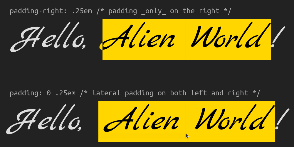
:focus或:hover链接时,“d”的末端伸出去了(演示)我们可以通过在链接上设置水平padding来解决这个问题。
a {
  /* same as before */
  padding: 0 .25em;
}如果您想知道为什么我们在左右两侧都设置了这个padding而不是只设置padding-right,原因如下所示。当我们的链接文本变成“Alien World”时,如果我们没有padding-left,“A”的卷曲开头将最终位于矩形之外。
上面这个带有多字链接的演示还突出显示了当我们缩小视口宽度时出现的另一个问题。

这里一个快速的解决方法是在链接上设置display: inline-block。这不是一个完美的解决方案。当链接文本长度超过视口宽度时,它也会失效,但它在这种特定情况下有效,所以现在我们先这样,过一会儿再回到这个问题。
inline-block解决方案(演示)现在让我们考虑一下浅色主题的情况。由于无法通过混合两个相同的高亮层(两者都不是white)来获得:hover或:focus时链接文本的white而不是black,因此我们需要在这里采用稍微不同的方法,一种不只涉及使用混合模式的方法。
在这种情况下,我们首先将background、普通段落文本color和链接文本color设置为我们想要的值,但反色。我最初是手动进行这种反色操作,但后来有人建议我使用Sass的invert()函数,这是一个非常棒的想法,确实简化了很多事情。然后,在我们拥有这个基本上是我们想要的浅色主题的反色暗色主题后,我们可以借助CSS的invert()过滤器函数再次反色,从而获得我们想要的结果。
这里有一个小警告:我们不能在body或html元素上设置filter: invert(1),因为这不会按照我们期望的方式工作,我们也不会得到想要的结果。但是,我们可以在围绕段落的包装器上同时设置background和filter。
<section>
  <p>Hello, <a href='#'>Alien World</a>!</p>
</section>
body {
/* same as before,
without the place-content, background and color declarations,
which we move on the section */
}
section {
display: grid;
place-content: center;
background: invert(#ddd) /* Sass invert(<color>) function */;
color: invert(#222); /* Sass invert<color>) function */;
filter: invert(1); /* CSS filter invert(<number|percentage>) function */
}
a {
/* same as before */
color: invert(purple); /* Sass invert(<color>) function */
}这是一个使用此效果的导航栏示例(以及许多其他巧妙的技巧,但这些不在本文的讨论范围之内)。选择不同的选项以查看其运行效果
我们还需要注意以下几点:当我们使用此技术时,section的所有后代都会被反色。这可能不是我们对img元素期望的结果——当我从暗色主题切换到浅色主题时,我肯定不希望看到博文中图像被反色。因此,我们应该在section的每个img后代上反转filter反色。
section {
  /* same as before */

  &, & img { filter: invert(1); }
}
将所有内容整合在一起,下面的演示显示了带图像的暗色和浅色主题案例
现在让我们回到包裹链接文本的问题,看看除了将a元素设为inline-block元素之外,我们是否还有更好的选择。
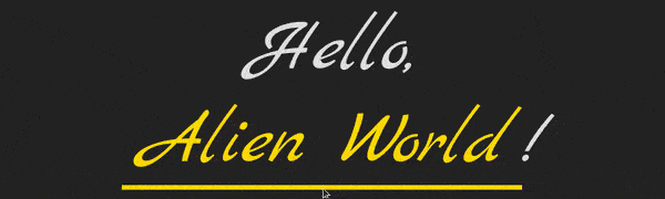
确实有!我们可以混合两个background层,而不是混合文本内容和伪元素。一层被裁剪到text,而另一层被裁剪到border-box,并且其垂直大小在悬停和焦点状态下在初始的5%和100%之间进行动画。
a {
  /* same as before */
  -webkit-text-fill-color: transparent;
     -moz-text-fill-color: transparent;
  --full: linear-gradient(currentColor, currentColor);
  background:
    var(--full),
    var(--full) 0 100%/1% var(--sy, 5%) repeat-x;
  -webkit-background-clip: text, border-box;
          background-clip: text, border-box;
  background-blend-mode: difference;
  transition: background-size .25s;

  &:focus, &:hover { --sy: 100%; }
}请注意,我们甚至不再需要伪元素了,因此我们从伪元素中获取了一些CSS,将其移动到链接本身,并对其进行了调整以适应这种新技术。我们已经从使用mix-blend-mode切换到使用background-blend-mode;我们现在正在转换background-size或transform,并且在:focus和:hover状态下;我们现在更改的不是transform,而是一个表示background-size垂直分量的自定义属性。

好多了,尽管这也不是一个完美的解决方案。
第一个问题是如果你检查了Firefox中标题的实时演示链接,你肯定会注意到的:它根本不起作用。这是由于Firefox的一个错误,我显然在2018年报告过,然后就忘记了,直到我开始玩混合模式并再次遇到它。
第二个问题是在录制中可以注意到的。链接看起来有些褪色。这是因为,出于某种原因,Chrome会将像链接这样的内联元素(请注意,对于像div这样的块级元素不会发生这种情况)与其最近的祖先(在这种情况下为section)的background混合,如果这些内联元素的background-blend-mode设置为除normal之外的任何值。
更奇怪的是,在链接或其父段落上设置isolation: isolate并不能阻止这种情况发生。我仍然有一种挥之不去的感觉,它一定与上下文有关,所以我决定继续尝试各种可能的解决方法,并希望也许某些方法最终会奏效。好吧,我不用花太多时间。将opacity设置为一个亚单位(但仍然足够接近1,因此不明显它不是完全不透明)的值可以解决问题。
a {
  /* same as before */
  opacity: .999; /* hack to fix blending issue ¯_(ツ)_/¯ */
}
最后一个问题是在录制中可以注意到的另一个问题。如果你看一下“Amur”末尾的“r”,你会注意到它的右侧被切掉了,因为它超出了背景矩形。如果你将其与“leopard”中的“r”进行比较,这一点尤其明显。
我并没有很高的期望能解决这个问题,但还是在Twitter上提出了这个问题。结果你猜怎么着,它可以被修复!结合我们已经设置的padding使用box-decoration-break可以帮助我们实现想要的效果!
a {
  /* same as before */
  box-decoration-break: clone;
}请注意,box-decoration-break仍然需要所有WebKit浏览器的-webkit-前缀,但与background-clip等属性(至少一个值为text)不同,自动前缀工具可以很好地处理这个问题。这就是为什么我没有在上面的代码中包含带前缀的版本。

我得到的另一个建议是添加一个负margin来补偿padding。我在这方面来回思考——我无法决定是否更喜欢有或没有它的结果。无论如何,这是一个值得一提的选择。
$p: .25em;

a {
  /* same as before */
  margin: 0 (-$p); /* we put it within parenthesis so Sass doesn't try to perform subtraction */
  padding: 0 $p;
}
margin来抵消padding时得到的结果(演示)尽管如此,我必须承认,仅仅动画渐变的background-position或background-size有点乏味。但感谢Houdini,我们现在可以变得更有创意,并动画渐变的任何组件,即使目前仅在Chromium中受支持。例如,如下所示的radial-gradient()的半径或conic-gradient()的进度。

仅反转元素(或background)的一部分
我经常看到这种效果是通过元素复制来实现的——两个副本层叠在一起,其中一个具有反转filter,另一个使用clip-path来显示两个层。另一种方法是叠加第二个元素,其alpha值足够低,以至于你甚至无法察觉它的存在,并使用backdrop-filter。
如果我们想反转整个元素及其所有内容和后代的一部分,这两种方法都能完成任务,但当我们想要反转background的一部分时,它们就无能为力了——filter和backdrop-filter都会影响整个元素,而不仅仅是它们的背景。虽然新的filter()函数(已受Safari支持)确实仅对background层有效,但它会影响背景的整个区域,而不仅仅是一部分。
这就是混合发挥作用的地方。该技术非常简单:我们有一个background层,我们想要反转其中的一部分,以及一个或多个渐变层,这些层为我们提供一个白色区域,我们希望在其中反转另一层,并在其他地方提供透明度(或黑色)。然后,我们使用今天讨论的两种混合模式之一进行混合。为了反转的目的,我更喜欢exclusion(它比difference少一个字符)。
这是一个第一个示例。我们有一个正方形元素,它具有一个两层的background。这两个层是一张猫的图片和一个在白色和透明之间具有急剧过渡的渐变。
div {
  background:
    linear-gradient(45deg, white 50%, transparent 0),
    url(cat.jpg) 50%/ cover;
}这给了我们以下结果。我们还设置了尺寸、border-radius、阴影,并在过程中美化了文本,但所有这些内容在这个上下文中并不重要。

接下来,我们只需要一个CSS声明来反转左下半部分。
div {
  /* same as before */
  background-blend-mode: exclusion; /* or difference, but it's 1 char longer */
}请注意,文本不受反转的影响;它仅应用于background。

你可能知道交互式的前后图像滑块。你甚至可能在CSS-Tricks上的这篇文章中看到过类似的东西。我在Compressor.io上看到过它,我经常用它来压缩图像,包括这些文章中使用的图像!
我们的目标是使用单个HTML元素创建类似的东西,使用不到100字节的JavaScript——甚至不需要太多CSS!
我们的元素将是一个range类型的input。我们没有设置它的min或max属性,因此它们分别默认为0和100。我们也没有设置value属性,因此它默认为50,这也是我们在其style属性中设置的自定义属性--k的值。
<input type='range' style='--k: 50'/>在CSS中,我们从基本的重置开始,然后将我们的input设置为一个占据整个视口高度的block元素。我们还为它的轨道和滑块提供了尺寸和虚拟背景,以便我们能够立即在屏幕上看到一些内容。
$thumb-w: 5em;

@mixin track() {
  border: none;
  width: 100%;
  height: 100%;
  background: url(flowers.jpg) 50%/ cover;
}

@mixin thumb() {
  border: none;
  width: $thumb-w;
  height: 100%;
  background: purple;
}

* {
  margin: 0;
  padding: 0;
}

[type='range'] {
  &, &::-webkit-slider-thumb,
  &::-webkit-slider-runnable-track { -webkit-appearance: none; }

  display: block;
  width: 100vw; height: 100vh;

  &::-webkit-slider-runnable-track { @include track; }
  &::-moz-range-track { @include track; }

  &::-webkit-slider-thumb { @include thumb; }
  &::-moz-range-thumb { @include thumb; }
}
下一步是在轨道上添加另一个background层,一个linear-gradient层,其中transparent和white之间的分隔线取决于当前range类型的input值--k,然后混合这两个层。
@mixin track() {
  /* same as before */
  background:
    url(flowers.jpg) 50%/ cover,
    linear-gradient(90deg, transparent var(--p), white 0);
  background-blend-mode: exclusion;
}

[type='range'] {
  /* same as before */
  --p: calc(var(--k) * 1%);
}请注意,轨道的这两个background层的顺序无关紧要,因为exclusion和difference都是可交换的。
它开始看起来像样了,但是拖动滑块并不会移动分隔线。这是因为当前值--k(渐变的分隔线位置--p依赖于它)不会自动更新。让我们用一小段JavaScript来修复它,这段JavaScript会在滑块值发生变化时获取滑块值,然后将--k设置为该值。
addEventListener('input', e => {
  let _t = e.target;
  _t.style.setProperty('--k', +_t.value)
})
现在一切似乎都正常工作了!
但真的如此吗?假设我们为滑块的background做一些更花哨的事情。
$thumb-r: .5*$thumb-w;
$thumb-l: 2px;

@mixin thumb() {
  /* same as before */
  --list: #fff 0% 60deg, transparent 0%;
  background:
    conic-gradient(from 60deg, var(--list)) 0/ 37.5% /* left arrow */,
    conic-gradient(from 240deg, var(--list)) 100%/ 37.5% /* right arrow */,
    radial-gradient(circle,
      transparent calc(#{$thumb-r} - #{$thumb-l} - 1px) /* inside circle */,
      #fff calc(#{$thumb-r} - #{$thumb-l}) calc(#{$thumb-r} - 1px) /* circle line */,
      transparent $thumb-r /* outside circle */),
    linear-gradient(
      #fff calc(50% - #{$thumb-r} + .5*#{$thumb-l}) /* top line */,
      transparent 0 calc(50% + #{$thumb-r} - .5*#{$thumb-l}) /* gap behind circle */,
      #fff 0 /* bottom line */) 50% 0/ #{$thumb-l};
  background-repeat: no-repeat;
}linear-gradient()创建细的垂直分隔线,radial-gradient()创建圆圈,两个conic-gradient()层创建箭头。
当拖动滑块从一端到另一端时,问题就变得很明显了:分隔线没有保持固定在滑块的垂直中线。
当我们将--p设置为calc(var(--k)*1%)时,分隔线从0%移动到100%。它实际上应该从一个起点移动,该起点是滑块宽度的一半,即$thumb-r,直到滑块宽度的一半之前,即100%。也就是说,在一个范围100%减去滑块宽度$thumb-w的范围内。我们从每一端减去一半,所以总共需要减去一个滑块宽度。让我们修复它!
--p: calc(#{$thumb-r} + var(--k) * (100% - #{$thumb-w}) / 100);好多了!
但是range输入的工作方式,它们的border-box在轨道的content-box(Chrome)或实际输入的content-box(Firefox)的限制内移动……这仍然感觉不对劲。如果滑块的中线(以及分隔线)一直延伸到视口的边缘,看起来会好得多。
我们无法更改range输入的工作方式,但我们可以使input向左扩展一个滑块宽度的一半,向右扩展另一个滑块宽度的一半。这使得它的width等于视口的宽度100vw,加上一个完整的滑块宽度$thumb-w。
body { overflow: hidden; }

[type='range'] {
  /* same as before */
  margin-left: -$thumb-r;
  width: calc(100vw + #{$thumb-w});
}还有一些与cursor相关的微调,就完成了!
这个效果的一个更花哨的版本(受Compressor.io网站的启发)是将input放在一张卡片中,当鼠标悬停在其上时,卡片的3D旋转也会发生变化。
我们也可以使用垂直滑块。这稍微复杂一些,因为我们唯一可靠的跨浏览器创建自定义样式的垂直滑块的方法是在其上应用旋转,但这也会旋转background。我们所做的是在(未旋转的)滑块容器上设置--p值和这些背景,然后保持input及其轨道完全transparent。
这可以在下面的演示中看到,在那里我正在反转一张我炫耀我心爱的Kreator连帽衫的照片。
当然,我们也可以使用radial-gradient()来获得很酷的效果。
background:
  radial-gradient(circle at var(--x, 50%) var(--y, 50%),
    #000 calc(var(--card-r) - 1px), #fff var(--card-r)) border-box,
$img 50%/ cover;在这种情况下,由--x和--y自定义属性给出的位置是根据鼠标在卡片上的移动计算出来的。
background的反转区域不一定要由渐变创建。它也可以是标题文本后面的区域,如这篇关于对比文本与背景图像的旧文章所示。
渐变反转
用于反转的混合技术在多种方面都比使用过滤器更强大。它还允许我们沿着渐变逐渐应用效果。例如,左侧根本没有反转,但然后我们向右进行,直到完全反转。
为了理解如何获得这种效果,我们必须首先理解如何获得invert(p)效果,其中p可以是[0%, 100%]区间内的任何值(如果我们使用十进制表示,则在[0, 1]区间内)。
第一种方法适用于difference和exclusion,即设置我们白色的alpha通道为p。这可以在下面的演示中看到,其中拖动滑块可以控制反转进度。
如果你想知道hsl(0, 0%, 100% / 100%)表示法,根据规范,这现在是表示alpha值为1的白色的有效方法。
此外,由于filter: invert(p)在一般情况下的工作方式(即,将每个通道值缩放为一个压缩区间[Min(p, q), Max(p, q)]),其中q是p的补码(或q = 1 - p),然后对其进行反转(从1中减去它),当部分反转它时,对于一个通用通道Ch,我们有以下内容:
1 - (q + Ch·(p - q)) =
= 1 - (1 - p + Ch·(p - (1 - p))) =
= 1 - (1 - p + Ch·(2·p - 1)) =
= 1 - (1 - p + 2·Ch·p - Ch) =
= 1 - 1 + p - 2·Ch·p + Ch =
= Ch + p - 2·Ch·p我们得到的结果正是exclusion的公式,其中另一个通道是p!因此,当另一个层为rgb(p, p, p)时,我们可以通过使用exclusion混合模式获得与filter: invert(p)相同的效果,对于[0%, 100%]区间内的任何p。
这意味着我们可以沿着一个linear-gradient()进行渐变反转,该渐变从左边缘的完全没有反转到右边缘的完全反转,如下所示:
background:
  url(butterfly_blues.jpg) 50%/ cover,
  linear-gradient(90deg,
    #000 /* equivalent to rgb(0%, 0%, 0%) and hsl(0, 0%, 0%) */,
    #fff /* equivalent to rgb(100%, 100%, 100%) and hsl(0, 0%, 100%) */);
background-blend-mode: exclusion;
请注意,使用从黑色到白色的渐变进行渐变反转仅适用于exclusion混合模式,而不适用于difference。在这种情况下,difference产生的结果,根据其公式,是一个伪渐变反转,它不会穿过中间的50%灰色,而是穿过RGB值,这些值在渐变的各个点处使三个通道中的每一个都归零。这就是为什么对比度看起来更强烈的原因。它可能也更具艺术性,但这并不是我能够发表意见的事情。
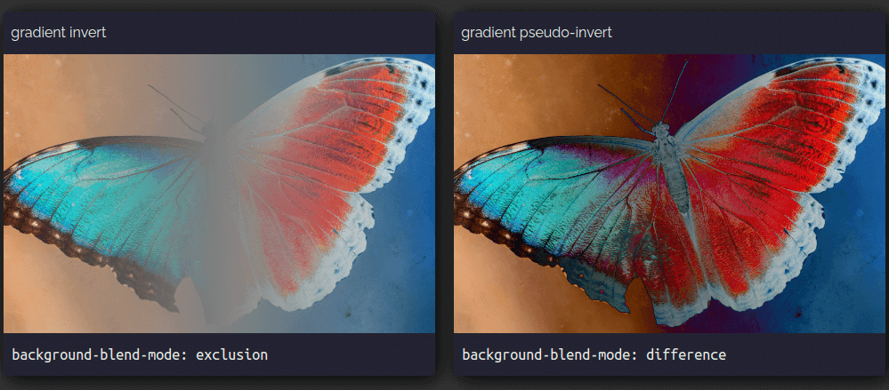
在background上实现不同级别的反转并不一定需要从黑色到白色的渐变。它也可以来自一张黑白图像,因为图像中的黑色区域会保留background-color,白色区域会完全反转它,而当使用exclusion混合模式时,介于两者之间的所有内容都会出现部分反转。difference将再次为我们提供更鲜明的双色调效果。
这可以在下面的交互式演示中看到,您可以在其中更改background-color并拖动两种混合模式产生的结果之间的分隔线。
空心交集效果
这里的基本思想是我们有两层,它们只有black和white像素。
波纹和光线
让我们考虑一个具有两个伪类的元素,每个伪类都有一个background,它是一个具有清晰停止点的重复CSS渐变。
$d: 15em;
$u0: 10%;
$u1: 20%;

div {
  &::before, &::after {
    display: inline-block;
    width: $d;
    height: $d;
    background: repeating-radial-gradient(#000 0 $u0, #fff 0 2*$u0);
    content: '';
  }

  &::after {
    background: repeating-conic-gradient(#000 0% $u1, #fff 0% 2*$u1);
  }
}根据浏览器和显示器,black和white之间的边缘可能看起来参差不齐……也可能不会。

为了保险起见,我们可以调整我们的渐变来消除此问题,方法是在black和white之间留出一个小距离$e。
$u0: 10%;
$e0: 1px;
$u1: 5%;
$e1: .2%;

div {
  &::before {
    background:
      repeating-radial-gradient(
        #000 0 calc(#{$u0} - #{$e0}),
        #fff $u0 calc(#{2*$u0} - #{$e0}),
        #000 2*$u0);
  }

  &::after {
    background:
      repeating-conic-gradient(
        #000 0% $u1 - $e1,
        #fff $u1 2*$u1 - $e1,
        #000 2*$u1);
  }
}
然后我们可以将它们一个放在另一个上面,并将mix-blend-mode设置为exclusion或difference,因为它们在这里都产生相同的结果。
div {
  &::before, &::after {
    /* same other styles minus the now redundant display */
    position: absolute;
    mix-blend-mode: exclusion;
  }
}无论顶层是black,混合操作的结果都与另一层相同,无论该层是black还是white。因此,black在black上生成black,而black在white上生成white。
无论顶层是white,混合操作的结果都与另一层反转相同。因此,white在black上生成white(black反转),而white在white上生成black(white反转)。
但是,根据浏览器,我们看到的实际结果可能看起来符合预期(Chromium)或像::before与我们在body上设置的灰色background混合,然后结果与::after混合(Firefox、Safari)。

body层混合而变得模糊(演示)Chromium 的行为方式是一个错误,但这是我们想要的结果。我们也可以在 Firefox 和 Safari 中获得它,方法是在父div上将isolation属性设置为isolate(演示)或从::before中删除mix-blend-mode声明(因为这将确保它与body之间的混合操作保持默认的normal,这意味着没有混合),并且只在::after上设置它(演示)。
当然,我们也可以简化操作,并使两个混合层成为元素上的background层,而不是它的伪类。这也意味着从mix-blend-mode切换到background-blend-mode。
$d: 15em;
$u0: 10%;
$e0: 1px;
$u1: 5%;
$e1: .2%;

div {
  width: $d;
  height: $d;
  background:
    repeating-radial-gradient(
      #000 0 calc(#{$u0} - #{$e0}),
      #fff $u0 calc(#{2*$u0} - #{$e0}),
      #000 2*$u0),
    repeating-conic-gradient(
      #000 0% $u1 - $e1,
      #fff $u1 2*$u1 - $e1,
      #000 2*$u1);;
  background-blend-mode: exclusion;
}
这为我们提供了完全相同的视觉效果,但消除了对伪元素的需求,消除了 Firefox 和 Safari 中潜在的意外mix-blend-mode副作用,并减少了我们需要编写的 CSS 量。

分屏
基本思想是我们有一个场景,一半是black,一半是white,还有一个从一侧移动到另一侧的white项目。然后使用difference或exclusion(两者都产生相同的结果)将项目层和场景层混合。
例如,当项目是一个球体时,实现此结果的最简单方法是使用radial-gradient表示它,使用linear-gradient表示场景,然后动画化background-position以使球体振荡。
$d: 15em;

div {
  width: $d;
  height: $d;
  background:
    radial-gradient(closest-side, #fff calc(100% - 1px), transparent)
      0/ 25% 25% no-repeat,
    linear-gradient(90deg, #000 50%, #fff 0);
  background-blend-mode: exclusion;
  animation: mov 2s ease-in-out infinite alternate;
}

@keyframes mov { to { background-position: 100%; } }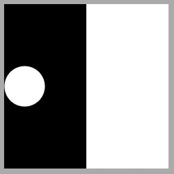
我们也可以使::before伪类成为场景,::after成为移动项目。
$d: 15em;

div {
  display: grid;
  width: $d;
  height: $d;

  &::before, &::after {
    grid-area: 1/ 1;
    background: linear-gradient(90deg, #000 50%, #fff 0);
    content: '';
  }

  &::after {
    place-self: center start;
    padding: 12.5%;
    border-radius: 50%;
    background: #fff;
    mix-blend-mode: exclusion;
    animation: mov 2s ease-in-out infinite alternate;
  }
}

@keyframes mov { to { transform: translate(300%); } }这可能看起来像我们过于复杂化了,考虑到我们获得了相同的视觉效果,但如果移动项目不仅仅是一个圆盘,而是一个更复杂的形状,并且运动不仅仅限于振荡,还具有旋转和缩放组件,那么这实际上是我们需要做的事情。
$d: 15em;
$t: 1s;

div {
  /* same as before */

  &::after {
    /* same as before */
    /* creating the shape, not detailed here as
       it's outside the scope of this article */
    @include poly;
    /* the animations */
    animation:
      t $t ease-in-out infinite alternate,
      r 2*$t ease-in-out infinite,
      s .5*$t ease-in-out infinite alternate;
  }
}

@keyframes t { to { translate: 300% } }
@keyframes r {
  50% { rotate: .5turn; }
  100% { rotate: 1turn;; }
}
@keyframes s { to { scale: .75 1.25 } }
请注意,虽然Safari 现在已加入 Firefox 支持我们在此处设置动画的各个转换属性,但这些属性在 Chrome 中仍处于**实验性 Web 平台功能**标志之后(可以通过chrome://flags启用,如下所示)。

更多示例
我们不会详细介绍这些演示背后的“如何”,因为使用exclusion或difference的混合效果的基本思想与之前相同,几何/动画部分不在本文的讨论范围之内。但是,对于以下每个示例,标题中都有一个指向 CodePen 演示的链接,并且许多这些 Pen 还附有我从头开始编写它们的录制视频。
这是我最近在Bees & Bombs GIF之后制作的交叉条动画。

这是几年前制作的循环月亮动画,也是在Bees & Bombs GIF之后编写的。

我们不一定要局限于black和white。在包装器上使用具有亚单位值的对比度filter(下面的示例中为filter: contrast(.65)),我们可以将黑色变成深灰色,白色变成浅灰色。

这是相同技术的另一个示例。

如果我们想让它看起来像我们在白色背景上的黑色形状之间有一个异或效果,我们可以在形状的包装器上使用filter: invert(1),如下面的示例所示。

如果我们想要一些更柔和的效果,例如浅灰色背景上的深灰色形状,我们不会进行完全反转,而只会进行部分反转。这意味着对反转filter使用亚单位值,如下面的示例中,我们使用filter: invert(.85)。

它不一定是循环或加载动画之类的东西。我们也可以在元素的背景及其偏移帧之间产生异或效果。就像前面的示例一样,如果我们希望背景和框架为black,它们的交集为white,则使用 CSS filter反转。

另一个示例是在悬停/聚焦和点击关闭按钮时产生异或效果。下面的示例显示了夜间和日光主题的情况。
赋予生命
只有黑白可能会显得有点黯淡,所以我们可以做一些事情来为这些演示注入一些活力。
第一个策略是使用滤镜。我们可以通过在降低对比度之后使用sepia()来摆脱黑白限制(因为此函数对纯black或white没有影响)。使用hue-rotate()选择色调,然后使用brightness()和saturate()或contrast()微调结果。
例如,对于之前的黑白演示之一,我们可以在包装器上使用以下filter链。
filter:
  contrast(.65) /* turn black and white to greys */
  sepia(1) /* retro yellow-brownish tint */
  hue-rotate(215deg) /* change hue from yellow-brownish to purple */
  blur(.5px) /* keep edges from getting rough/ jagged */
  contrast(1.5) /* increase saturation */
  brightness(5) /* really brighten background */
  contrast(.75); /* make triangles less bright (turn bright white dirty) */
为了对结果进行更精细的控制,始终可以选择使用 SVG 滤镜。
第二个策略是添加另一层,该层不是黑白的。例如,在这个我为三月份的第一个 CodePen 挑战制作的放射性派演示中,我在body上使用了紫色::before伪元素,并将其与派包装器混合。
body, div { display: grid; }

/* stack up everything in one grid cell */
div, ::before { grid-area: 1/ 1; }

body::before { background: #7a32ce; } /* purple layer */

/* applies to both pie slices and the wrapper */
div { mix-blend-mode: exclusion; }

.a2d { background: #000; } /* black wrapper */

.pie {
  background: /* variable size white pie slices */
    conic-gradient(from calc(var(--p)*(90deg - .5*var(--sa)) - 1deg),
      transparent,
      #fff 1deg calc(var(--sa) + var(--q)*(1turn - var(--sa))),
      transparent calc(var(--sa) + var(--q)*(1turn - var(--sa)) + 1deg));
}
这会将黑色包装变成紫色,白色部分变成绿色(这是紫色的反色)。

另一种选择是再次将整个包装与另一层混合,这次使用与difference或exclusion不同的混合模式。这样做将使我们能够更好地控制结果,因此我们不限于互补色(如黑色和白色,或紫色和绿色)。但是,这将在以后的文章中介绍。
最后,可以选择使用difference(而不是exclusion),以便在两个相同的(不一定是white)层重叠的地方获得black。例如,coral和coral之间的差异在所有三个通道上始终为0,这意味着black。这意味着我们可以调整偏移和XOR帧的演示,以获得以下结果

通过一些正确设置的transparent边框和背景裁剪,我们也可以使渐变背景生效。

类似地,我们甚至可以使用图像而不是渐变!

请注意,这意味着在第二个主题场景中反转元素时,我们也必须反转图像背景。但这应该不成问题,因为在本文中我们也学习了如何做到这一点:通过将background-color设置为white,并使用background-blend-mode: exclusion将其与图像层混合!
总结
仅仅这两种混合模式就可以帮助我们获得一些非常酷的结果,而无需诉诸canvas、SVG或重复层。但我们这里只是触及了表面。在以后的文章中,我们将深入探讨其他混合模式的工作原理,以及我们如何单独使用它们或与以前的混合模式或其他CSS视觉效果(如滤镜)结合使用来实现什么。相信我,你掌握的技巧越多,你就能获得越酷的结果!
很棒的文章,和惊人的演示!
这篇文章真的让我惊叹,很棒的工作