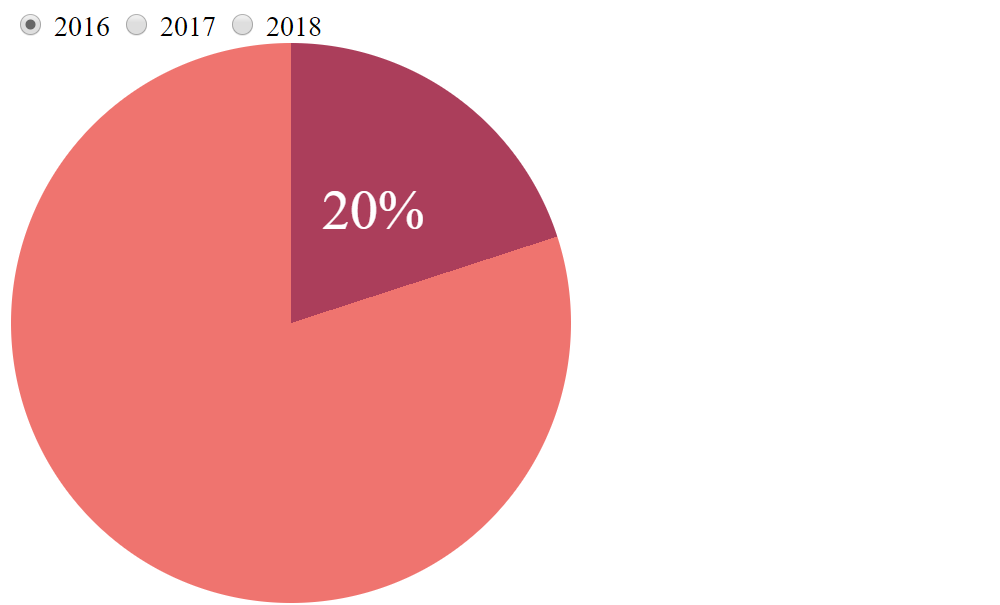
当我偶然发现这个 交互式 SVG 饼图 时,我萌生了做类似事情的想法。虽然 SVG 代码尽可能简洁(一个单一的 <circle> 元素!),但使用描边来创建饼图切片存在问题,因为我们在 Firefox 和 Edge 的 Windows 上遇到了 渲染问题。此外,在 2018 年,我们可以用更少的 JavaScript 实现更多功能!
我设法使用一个 HTML 元素来表示图表,以及极少的 JavaScript 代码实现了以下结果。未来应该完全不需要任何 JavaScript,但稍后再详细介绍。

你们中的一些人可能还记得 Lea Verou 的 Missing Slice 演讲——我的解决方案基于她的技术。本文详细分析了这一切是如何运作的,展示了我们在优雅降级和使用此技术的其他方法方面可以做些什么。
HTML
我们使用 Pug 从一个 data 对象生成 HTML,该对象包含过去三年的无单位百分比值。
- var data = { 2016: 20, 2017: 26, 2018: 29 }我们让所有元素都驻留在一个 .wrap 元素中。然后,我们遍历 data 对象,并为其每个属性创建一个带有相应 label 的单选 input。之后,我们向其中添加一个 .pie 元素。
- var darr = [], val;

.wrap
  - for(var p in data) {
    - if(!val) val = data[p];
    input(id=`o${p}` name='o' type='radio' checked=val == data[p])
    label(for=`o${p}`) #{p}
    - darr.push(`${data[p]}% for year ${p}`)
  - }
  .pie(aria-label=`Value as pie chart. ${darr.join(', ')}.`
       role='graphics-document group')
上述 Pug 代码编译成以下 HTML
<style><div class="wrap">
  <input id="o2016" name="o" type="radio" checked="checked"/>
  <label for="o2016">2016</label>
  <input id="o2017" name="o" type="radio"/>
  <label for="o2017">2017</label>
  <input id="o2018" name="o" type="radio"/>
  <label for="o2018">2018</label>
  <div class="pie" aria-label="Value as pie chart. 20% for year 2016, 26% for year 2017, 29% for year 2018." role="graphics-document group"></div>
</div>
请注意,我们还确保只有第一个单选 input 被选中。
将自定义属性传递给 CSS
我通常不喜欢在 HTML 中放置样式,但在这种特殊情况下,这是一种非常有用的方法,可以将自定义属性值传递给 CSS,并确保如果我们需要更改任何数据点,我们只需要在一个地方更新内容即可——Pug 代码。CSS 保持不变。
诀窍是在每个可能被选中的单选 input 的 .pie 元素上设置一个无单位的百分比 --p。
style
  - for(var p in data) {
    | #o#{p}:checked ~ .pie { --p: #{data[p]} }
  - }
在确保其尺寸(包括 border 和 padding)均不为 0 后,我们使用此百分比在 .pie 元素上应用 conic-gradient()。
$d: 20rem;

.wrap { width: $d; }

.pie {
  padding: 50%;
  background: conic-gradient(#ab3e5b calc(var(--p)*1%), #ef746f 0%);
}
请注意,这需要原生 conic-gradient() 支持,因为 polyfill 不适用于 CSS 变量。目前,这将支持范围限制在启用了“**实验性 Web 平台功能**”标志的 Blink 浏览器,不过情况肯定会好转。

**更新**:Chrome 69+ 现在也原生支持 conic-gradient(),无需启用标志。
现在我们有了演示的工作骨架——通过单选按钮选择不同的年份会导致不同的 conic-gradient()!

显示值
下一步是实际显示当前值,我们通过伪元素来实现。不幸的是,数字类型的 CSS 变量不能用于 content 属性的值,因此我们通过使用 counter() 技巧来解决这个问题。
.pie:after {
  counter-reset: p var(--p);
  content: counter(p) '%';
}
我们还调整了 color 和 font-size 属性,使我们的伪元素更易于查看。

平滑过渡
我们不希望值之间出现突然的变化,因此我们借助 CSS transition 来平滑过渡。在我们可以转换或动画化 --p 变量之前,我们需要在 JavaScript 中注册它。
CSS.registerProperty({
  name: '--p',
  syntax: '<integer>',
  initialValue: 0,
  inherits: true
});
请注意,使用 <number> 而不是 <integer> 会导致显示的值在 transition 期间变为 0,因为我们的计数器需要一个整数。感谢 Lea Verou 帮助我解决了这个问题!
另请注意,显式设置 inherits 是强制性的。这在最近之前并不是这样。
这是此演示所需的全部 JavaScript 代码,将来我们甚至不需要这么多代码,因为我们将能够 从 CSS 注册自定义属性。
解决了这个问题,我们可以在 .pie 元素上添加 transition。
.pie {
  /* same styles as before */
  transition: --p .5s;
}
功能就到这里了!所有操作都通过一个元素、一个自定义变量和一点 Houdini 魔法完成!

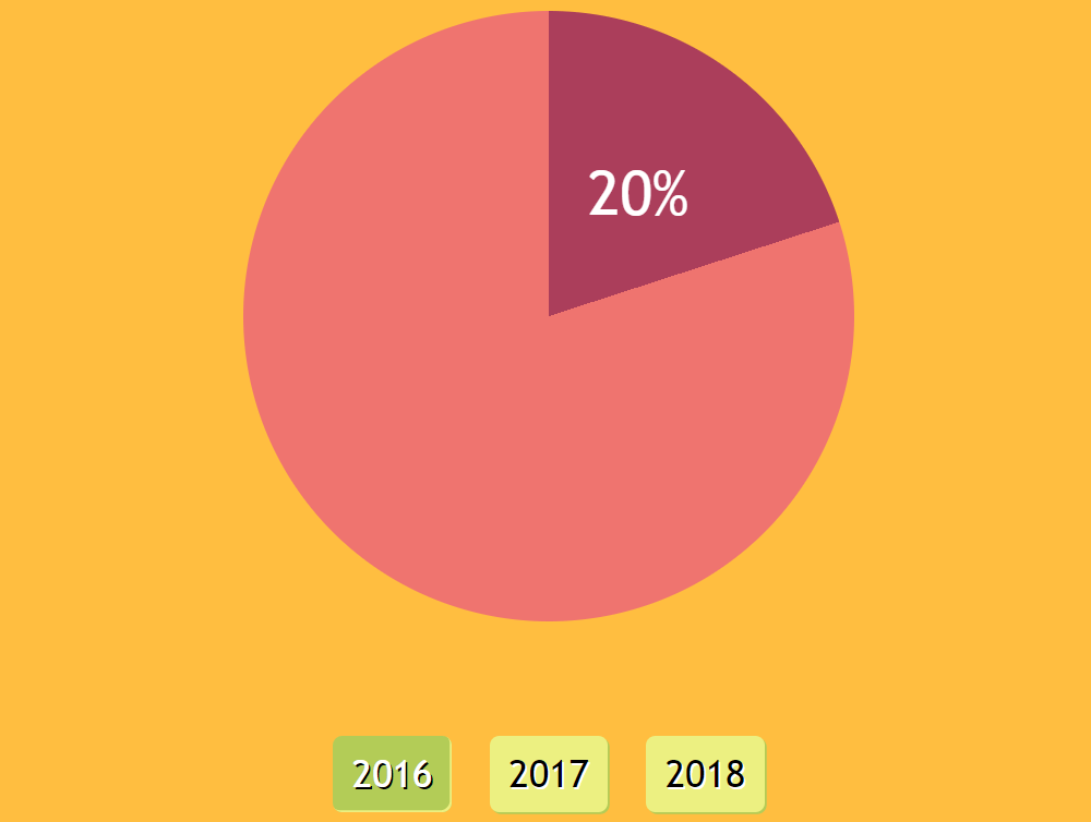
美化修饰
虽然我们的演示功能齐全,但在这一点上看起来一点也不漂亮。所以,让我们在处理它的同时解决这个问题!
使饼图……更像饼图!
由于 :after 的存在增加了其 .pie 父元素的 height,因此我们将其绝对定位。并且由于我们希望我们的 .pie 元素看起来更像一个真正的饼图,因此我们使用 border-radius: 50% 使其变圆。

我们还希望在深色饼图切片的中间显示百分比值。
为了做到这一点,我们首先将其定位在 .pie 元素的正中间。默认情况下,:after 伪元素显示在其父元素内容之后。由于 .pie 在这种情况下没有内容,因此 :after 伪元素的左上角位于父元素的 content-box 的左上角。在这里,content-box 是 padding-box 中心处的 0x0 框。请记住,我们已将 .pie 的 padding 设置为 50%——一个相对于包装器 width 的值,适用于水平和垂直方向!
这意味着 :after 的左上角位于其父元素的中间,因此在其上应用 translate(-50%, -50%) 会将其向左移动其自身 width 的一半,并向上移动其自身 height 的一半,使其自身的中心点与 .pie 的中心点重合。
请记住,% 值的平移是 相对于其应用于的元素的尺寸 沿相应轴进行的。换句话说,沿 x 轴的 % 值的平移相对于元素的 width,沿 y 轴的 % 值的平移相对于其 height,沿 z 轴的 % 值的平移相对于其深度,该深度始终为 0,因为所有元素都是平面二维框,在第三轴上的深度为 0。

接下来,我们 rotate 该值,使其 x 轴的正半部分将深色切片分成两个相等的部分,然后沿着这个现在已旋转的 x 轴将其 translate 半个饼图半径。
请参阅 thebabydino 在 CodePen 上创建的 Pen(@thebabydino)。
我们需要弄清楚的是,如何旋转 :after 伪元素才能使其 x 轴将深色切片分成两个相等的部分。让我们分解一下!
最初,x轴是水平的,指向右侧,所以为了使其指向所需的方向,我们首先需要将其旋转,使其指向向上并沿着切片的起始边。然后它需要顺时针旋转半个切片。
为了使轴指向向上,我们需要将其旋转-90deg。减号是因为正值遵循顺时针方向,而我们正在向相反方向旋转。
查看thebabydino在CodePen上创建的Pen(@thebabydino)。
接下来,我们需要将其旋转半个切片。
查看thebabydino在CodePen上创建的Pen(@thebabydino)。
但是半个切片是多少度呢?
嗯,我们已经知道这个切片占圆饼的百分比:它是我们的自定义属性--p。如果我们将该值除以100,然后乘以360deg(或1turn,使用什么单位都没关系),我们就可以得到暗色切片的中心角。
在-90deg旋转之后,我们需要将:after顺时针(正方向)旋转这个中心角的一半。
这意味着我们应用以下transform链
translate(-50%, -50%) rotate(calc(.5*var(--p)/100*1turn - 90deg)) translate(.25*$d);最后的平移是$d的四分之一,它是包装器width,也为我们提供了.pie的直径。(由于.pie的content-box是一个0x0的盒子,它没有border,并且它的左右padding都是其包装器父元素width的50%。).pie的半径是其直径的一半,这意味着半径的一半是直径的四分之一($d)。
现在值标签位于我们想要的位置

但是,仍然存在一个问题:我们不希望它被旋转,因为在某些角度下,这看起来会非常别扭且令人费解。为了解决这个问题,我们在最后恢复旋转。为了方便起见,我们将旋转角度存储在一个名为--a的CSS变量中
--a: calc(.5*var(--p)/100*1turn - 90deg);
transform:
  translate(-50%, -50%)
  rotate(var(--a))
  translate(.25*$d)
  rotate(calc(-1*var(--a)));
好多了!
布局
我们希望整个组件位于屏幕中央,因此我们使用一个简洁的网格技巧来解决这个问题
body {
  display: grid;
  place-items: center center;
  margin: 0;
  min-height: 100vh
}好的,这将整个.wrap元素置于中央

下一步是将饼图放置在单选按钮上方。我们通过在.wrap元素上使用弹性盒布局来实现这一点
.wrap {
  display: flex;
  flex-wrap: wrap-reverse;
  justify-content: center;
  width: $d;
}
设置单选按钮的样式
…或者更准确地说,我们正在设置单选按钮标签的样式,因为我们做的第一件事就是隐藏单选按钮输入
[type='radio'] {
  position: absolute;
  left: -100vw;
}
由于这导致了一些非常难看的标签,这些标签很难彼此区分,因此让我们为每个标签添加一些margin和padding,使它们看起来不那么拥挤,再加上背景,以便它们的点击区域清晰地突出显示。我们甚至可以添加盒子阴影和文本阴影以获得一些3D效果。当然,当它们对应的输入被:checked时,我们可以创建一个单独的样式。
$c: #ecf081 #b3cc57;

[type='radio'] {
   /* same as before */

  + label {
    margin: 3em .5em .5em;
    padding: .25em .5em;
    border-radius: 5px;
    box-shadow: 1px 1px nth($c, 2);
    background: nth($c, 1);
    font-size: 1.25em;
    text-shadow: 1px 1px #fff;
    cursor: pointer;
  }

  &:checked {
    + label {
      box-shadow: inset -1px -1px nth($c, 1);
      background: nth($c, 2);
      color: #fff;
      text-shadow: 1px 1px #000;
    }
  }
}我们还稍微增大了font-size,并设置了border-radius以使角变得圆滑

最后的修饰
让我们在body上设置一个background,调整整个内容的font,并为单选按钮标签添加一个transition
优雅降级
虽然我们的演示现在在Blink浏览器中看起来不错,但在所有其他浏览器中看起来都很糟糕……而且大多数浏览器都是这样!
首先,让我们将我们的工作放在一个@supports块中,该块检查对原生conic-gradient()的支持,以便支持它的浏览器会渲染饼图。这包括我们的conic-gradient()、使饼图具有相等水平和垂直尺寸的padding、使饼图呈圆形的border-radius,以及将值标签定位在饼图切片中间的transform链。
.pie {
  @supports (background: conic-gradient(tan, red)) {
    padding: 50%;
    border-radius: 50%;
    background: conic-gradient(var(--stop-list));
    --a: calc(.5*var(--p)/100*1turn - 90deg);
    --pos: rotate(var(--a))
           translate(#{.25*$d})
           rotate(calc(-1*var(--a)));
    }
  }
}现在,让我们使用linear-gradient()为所有其他浏览器构建一个条形图作为后备方案。我们希望我们的条形图横跨.wrap元素,以便水平padding仍然是50%,但垂直方向是一个窄条。我们仍然希望图表足够高以容纳值标签。这意味着我们使用较小的垂直padding。我们还减少了border-radius,因为50%会给我们一个椭圆,而我们需要的是一个带圆角的矩形。
后备方案还将conic-gradient()替换为从左到右的linear-gradient()。由于创建后备条形图的linear-gradient()和创建饼图的conic-gradient()都使用相同的停止列表,因此我们可以将其存储在CSS变量(--stop-list)中,这样我们甚至不必在编译后的CSS中重复它。
最后,我们希望值标签位于后备方案条形图的中间,因为我们不再有饼图切片了。这意味着我们将所有居中后的定位存储在一个CSS变量(--pos)中,该变量在不支持conic-gradient()的情况下值为null,否则为之前的transform链
.pie {
  padding: 1.5em 50%;
  border-radius: 5px;
  --stop-list: #ab3e5b calc(var(--p)*1%), #ef746f 0%;
  background: linear-gradient(90deg, var(--stop-list));
  /* same as before */

  &:after {
    transform: translate(-50%, -50%) var(--pos, #{unquote(' ')});
    /* same as before */
  }

  @supports (background: conic-gradient(tan, red)) {
    padding: 50%;
    border-radius: 50%;
    background: conic-gradient(var(--stop-list));
    --a: calc(.5*var(--p)/100*1turn - 90deg);
    --pos: rotate(var(--a))
           translate(#{.25*$d})
           rotate(calc(-1*var(--a)));
    }
  }
}我们还切换到在body上使用弹性盒布局(因为,尽管它可能很巧妙,但grid布局在Edge中会出错)。
body {
  display: flex;
  align-items: center;
  justify-content: center;
  /* same as before */
}所有这些都为不支持conic-gradient()的浏览器提供了条形图后备方案。

使其具有响应性
我们仍然存在的一个问题是,如果视口比饼图直径窄,那么事情看起来就不那么好了。
CSS变量和媒体查询来救援!
我们将直径设置为一个CSS变量(--d),该变量用于设置饼图尺寸以及值标签在其切片中间的位置。
.wrap {
  --d: #{$d};
  width: var(--d);
  /* same as before */

  @media (max-width: $d) { --d: 95vw }
}在某些视口宽度以下,我们还会减小font-size、<label>元素的margin,并且我们不再将值标签定位在暗色饼图切片的中间,而是定位在饼图本身的中间
.wrap {
 /* same as before */

@media (max-width: 265px) { font-size: .75em; }
}

[type='radio'] {
   /* same as before */

  + label {
    /* same as before */

    @media (max-width: 195px) { margin-top: .25em; }
  }
}

.pie{
   /* same as before */

  @media (max-width: 160px) { --pos: #{unquote(' ')} }
}这给了我们最终的结果:在原生支持conic-gradient()的浏览器中的响应式饼图。而且,尽管目前这仅仅是Blink浏览器,但我们有一个可靠的后备方案,可以为所有其他浏览器渲染响应式条形图。我们还在值之间添加了动画——目前这甚至更加有限,仅限于启用了实验性 Web 平台功能标志的 Blink 浏览器。
查看thebabydino在CodePen上创建的Pen(@thebabydino)。
额外内容:径向进度!
我们还可以应用这个概念来构建一个类似于下面的径向进度指示器(灵感来自这个Pen)

技术基本相同,除了我们将值标签保留在中间并设置conic-gradient()在:before伪元素上。这是因为我们使用mask来去除所有内容,除了一个细细的外环,如果我们在元素本身设置conic-gradient()和mask,那么mask也会隐藏内部的值标签,而我们希望它可见。
点击<button>时,会随机生成一个新的无单位百分比(--p)值,我们会在值之间平滑过渡。设置固定的transition-duration会在两个接近的值(例如47%到49%)之间产生非常缓慢的transition,而在值之间差距较大的情况下(例如3%到98%)则会产生非常快速的transition。我们通过使transition-duration依赖于--p先前值与其新生成值之间差的绝对值来解决这个问题。
[id='out'] { /* radial progress element */
  transition: --p calc(var(--dp, 1)*1s) ease-out;
}
const _GEN = document.getElementById('gen'),
_OUT = document.getElementById('out');
_GEN.addEventListener('click', e => {
let old_perc = ~~_OUT.style.getPropertyValue('--p'),
new_perc = Math.round(100*Math.random());
_OUT.style.setProperty('--p', new_perc);
_OUT.style.setProperty('--dp', .01*Math.abs(old_perc - new_perc));
_OUT.setAttribute('aria-label', `Graphical representation of generated percentage: ${new_perc}% of 100%.`)
}, false);这为支持所有新功能的浏览器提供了一个不错的动画径向进度指示器。对于不支持原生conic-gradient()的浏览器,我们有一个线性回退,并且在没有Houdini支持的情况下没有transition。
查看thebabydino在CodePen上创建的Pen(@thebabydino)。
很棒的信息。从上周开始,我一直在收集关于CSS变量的详细信息。
你的博客上有一些我以前不知道的惊人细节。谢谢。
很棒的教程!非常有帮助。
很棒的文章!自从Chrome在标志后面启用该选项以来,我也一直在试验圆锥渐变和饼图,但Houdini使动画变得更加出色。
只是一个愚蠢的问题,为什么要将单选按钮隐藏在视口之外?
display: none不也能起作用吗?因为据我所知,并非所有屏幕阅读器都能读取使用
display: none隐藏的元素。我还没有测试过这一点。我尝试使用屏幕阅读器,但发现几乎不可能理解它的工作原理。所以为了安全起见,我不会在希望屏幕阅读器读取的内容上设置display: none。很棒的文章,但是您需要使用Pug吗?这对那些(包括我)试图学习您试图传达的核心概念的人来说,只是增加了额外的复杂性。只是一些建设性的批评 :)
如果您点击“查看编译”(悬停时显示在右下角),则可以阅读旧的HTML。
我对这篇文章也有同样的问题。“查看编译”选项在手机上似乎不可用(可能是隐藏在屏幕外了?)。
你发现Pug中哪些地方难以理解?严肃的问题。因为我使用Pug而不是纯HTML正是为了减少额外的复杂性。我知道第一次看到这类东西,我会更难理解HTML。Pug只是一个更紧凑、更易读的版本,这就是我使用它的原因,为了使其更容易理解,因为HTML有时看起来像是有人在屏幕上乱吐字符,有很多重复和冗余,这使得更难弄清楚从哪里开始。
无论如何,我将在文章中添加编译后的版本。